Dashboards have been in existence now for a long time, at least among enterprise customers. Consuming information from digital cockpits throwing out KPIs, indicators and charts have almost become a regular chore as having your morning cup of coffee, and desktops/laptops have been the go-to tools for consuming the same. A recent trend which has emerged is the need to consume data via mobiles phone, and why not? When these devices have enough computing power to sometime put even desktops to shame, this is not entirely unthinkable.
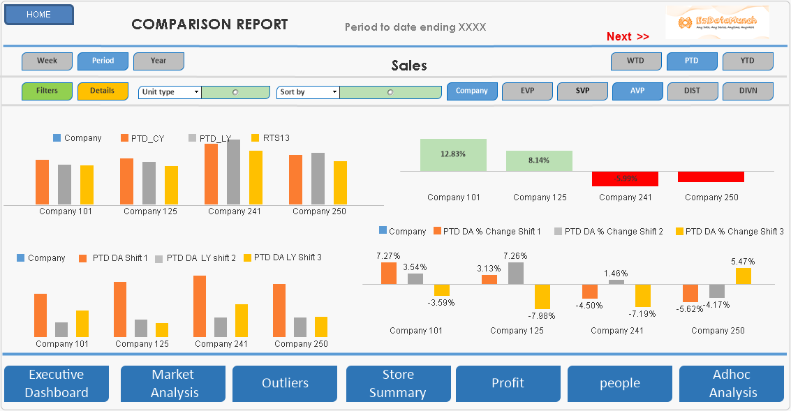
But the challenge is one of real-estate space or screen space, as mobile screens have more vertical space as compared to horizontal, which poses a task while viewing some types of content, especially business dashboards. For example, take a look at this sample corporate dashboard below:

Source: Google Images
The above dashboard looks exceptionally good from a UI perspective and provides relevant information from the end-user to consume. By looking at the image, it is also quite obvious that this dashboard is designed for the desktop. Imagine if the same needed to be consumed on mobile devices. What happens then?
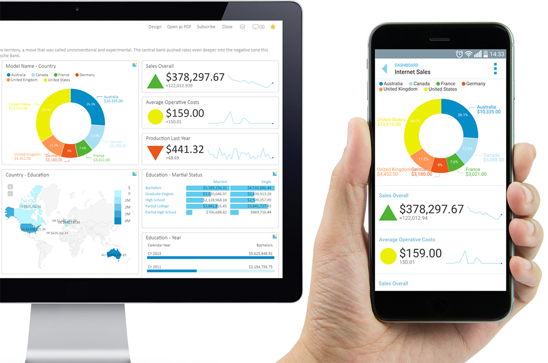
Well, there are a few ways that can help achieve this. One would be to consume the information through the browser, in which case we could end with a lot of horizontal and vertical scrolls, completely killing the UX and the comprehension capability. Another way is, if the framework on which the dashboard is built supports a responsive framework, then either through the mobile browser or through an app, the same can be consumed, and the browser or app will render in the best possible way for consumption. But from a UX perspective, this rendering does not enable the key requirement of the dashboard which is data insights. In the mobile interface, the objects would be loaded into a vertical grid and as a user, you would be left with a lot of vertical scrolls, depending on the device in use, which primarily reduces comprehension ability, and is the key for data insight.
Another solution would be to build a mobile-specific dashboard that might solve both the UI and UX problems but leaves you with two applications to be maintained and managed.

Source: Google Images
The above image clearly explains the problem.
Most of the visualization tools today come with a mobile app, but the practical issue is, if we try and convert a desktop dashboard into a mobile device, we are just solving the rendering issue and completely killing the objective of data discovery. This has been our experience with one of our recent customers as well.
So, did we solve the issue? Yes, we did! And before we go ahead and explain the approach which we adopted to solve the problem, I would like to explain the path taken while analyzing a dashboard. The initial starting point is data, which could be an indicator, triggering further insights for deep analysis and finally, action to resolve the anomaly or implement a change tested through a hypothesis.
Our approach was to break this value chain into two parts - we built a mobile-specific dashboard which provided the key metrics in the mobile where data is consumed and anomalies are identified and then, the user moved into a full-blown desktop application for executing the insight and action activities.
While building the mobile app, we used custom visualization suitable for mobile consumption, while keeping the backend data the same as the desktop application, thereby optimizing development efforts. This also ensured rich and relevant UI and UX at both layers, at the same time solving the business objective of mobility.
The flip side of this approach is that we are now left with two applications to manage, but that is a trade-off we would need to make between usability and manageability, especially when there is a significant investment in a current visualization tech stack. We feel, this is going to be the hygiene factor going forward and we hope there would be more mobile native visualization tools emerging in the future.